MyData Assistant
MyData, developed by Analytics Intelligence, is an AI-powered data assistant that integrates directly into collaborative platforms like Slack to transform how teams access and use analytics. Instead of navigating complex dashboards or waiting for scheduled reports, users can simply ask questions in plain language and instantly receive relevant metrics, visualizations, and insights.
Challenges
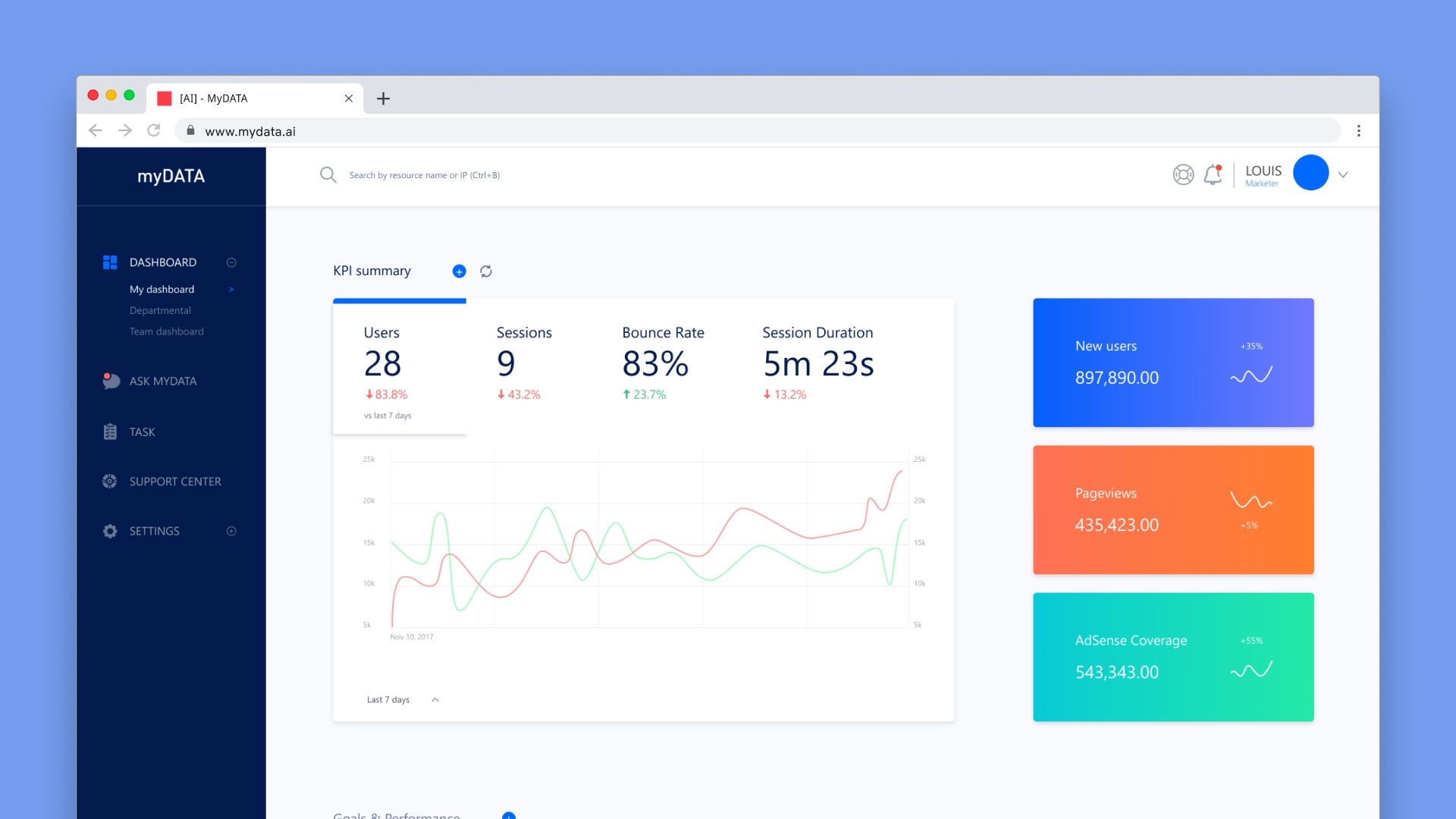
While the platform’s concept was groundbreaking, its execution presented challenges that hindered user adoption and satisfaction. I was tasked with revamping the platform’s user experience—streamlining core functionalities, introducing impactful new features, and establishing a robust design system for future scalability.
Challenges
- Complex User Flows:
The original platform’s interface made even basic tasks such as customizing communication channels or setting KPI insights was complicated and unintuitive. - Overwhelming Navigation:
Important features were buried under multiple layers, making them hard to discover and use efficiently. - Inconsistent Design Language:
The absence of a unified design system resulted in visual and interaction inconsistencies across the product. - Feature Underutilization:
Despite powerful capabilities, many features went unused because users couldn’t easily find or understand them.
Process & Approach
-
- Before diving into design changes, I reviewed already-outlined user pain points provided by the team, which offered a clear foundation of known challenges. To validate and expand on these insights, I immersed myself in the platform—navigating it as a first-time user, attempting core tasks, and documenting additional friction points. This dual approach ensured I addressed both known and newly discovered issues.
- I held multiple sessions with the development team to understand the technical foundations, limitations, and opportunities. These discussions ensured that design improvements aligned with existing infrastructure and development feasibility.
- Using journey mapping, I identified high-friction areas and prioritized them based on user impact and development effort. This guided the order of feature redesigns and enhancements.
- I developed multiple prototype variants for simplified workflows, focusing on reducing clicks, improving discoverability, and making processes intuitive. These prototypes underwent stakeholder reviews and iterative adjustments based on feedback.
- In addition to revamping existing functions, I designed and integrated new features that elevated usability and productivity like Customizable Insight Page where users could personalize their analytics view with KPIs, widgets, and layout preferences.
- I created a foundational design system containing only the most essential components, styles, and interaction patterns needed to ensure immediate consistency across the platform.
Main Deliverables included:
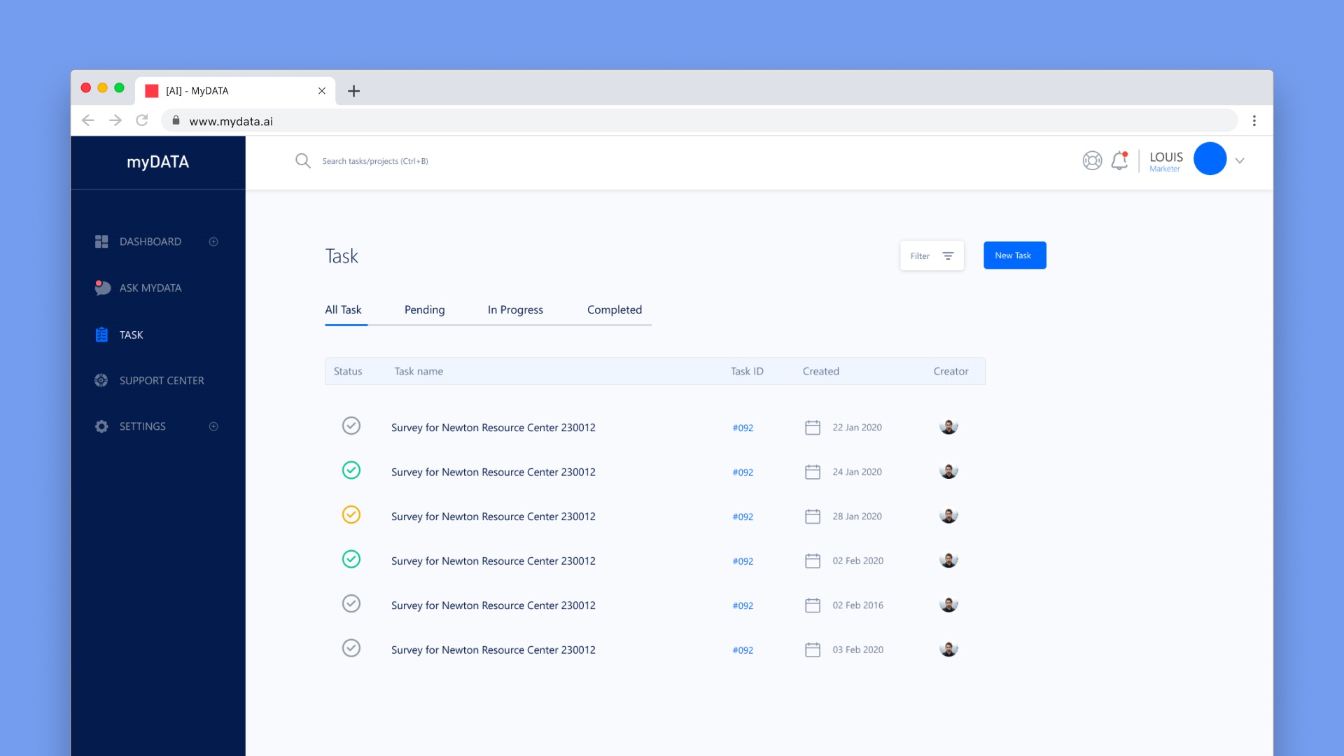
- Task Setup Page – A streamlined interface for defining, assigning, and tracking analytics-related tasks.
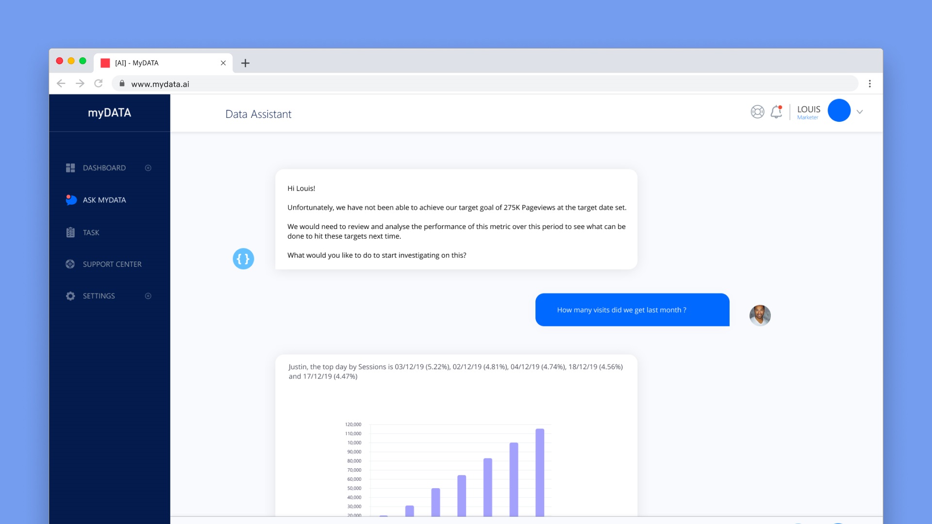
- AI Data Assistant (Interactive Chatbot) – Enhanced conversational capabilities for data queries and proactive insight suggestions.
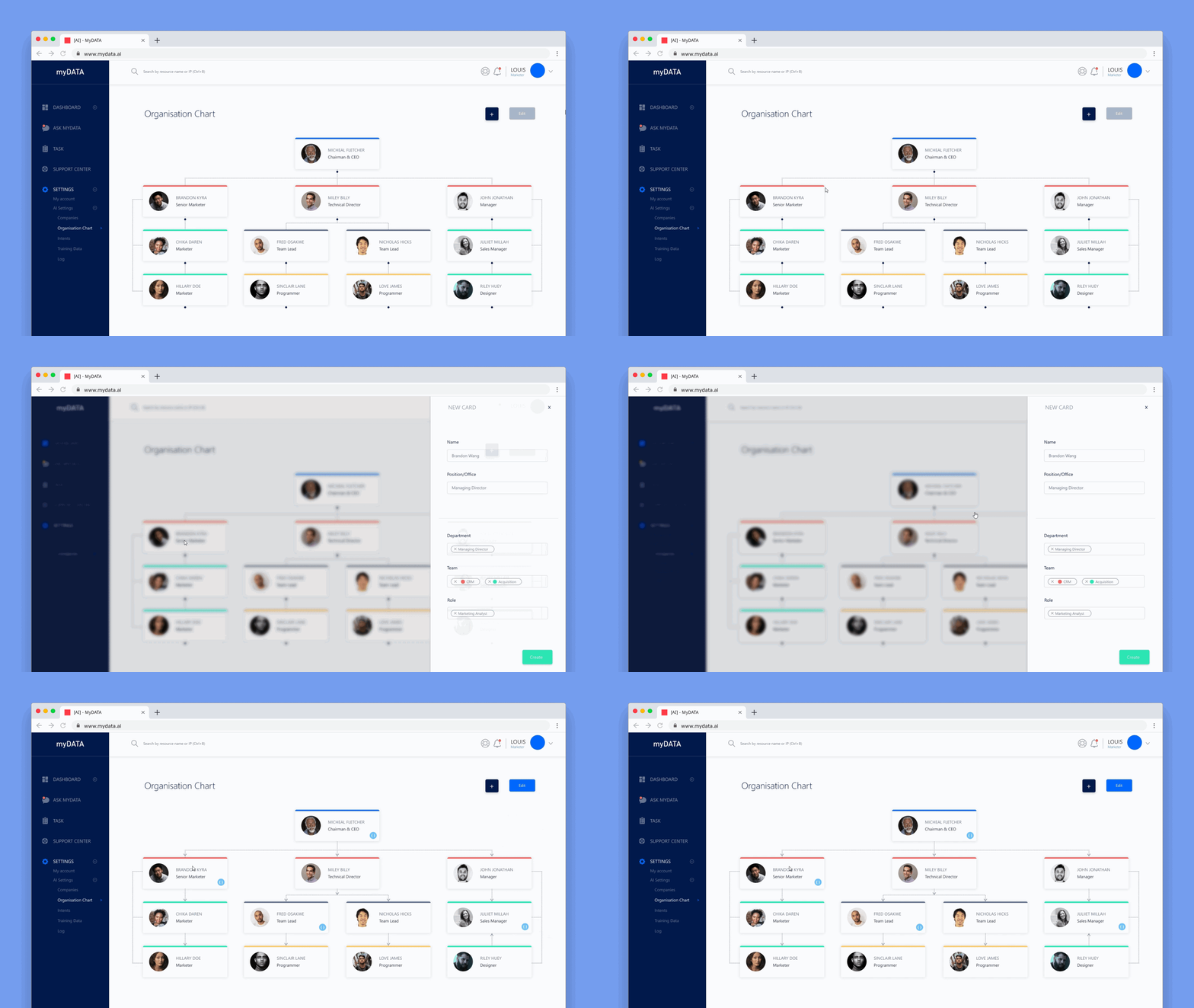
- Role Management System – Granular permissions to cater to different organizational structures.
- Multi-Settings Page – Consolidated settings hub for channels, notifications, KPIs, and reporting preferences.
Outcomes
- Workflows became faster and more intuitive, while new customization features gave users greater control over how they accessed and received insights.
- Enhanced features like role assignment, intelligent chat, and customizable dashboards.
Previously underused capabilities like custom KPI tracking and multi-channel reporting saw a sharp increase in engagement.
The new design system brought visual harmony, improved accessibility, and accelerated the development of new features.
Feedback from beta testers and existing clients highlighted ease of use, better control, and faster access to insights as key wins.